A small Japandi bathroom works when wood tones, mineral textures, simple fixtures, and soft lighting form a coherent palette. Start with the atmosphere you want: warm oak and ivory, sage green with a dark countertop, pale wood layered with tactile surfaces, or walnut and anthracite. These four concepts use the same compact, elongated space to show how materials alone can shift its character without changing the layout.
What Defines a Small Japandi Bathroom?
Japandi brings together Japanese restraint and the Scandinavian emphasis on comfort and function. In a bathroom, that usually means straightforward forms, natural or mineral surfaces, thoughtful lighting, and storage that keeps everyday necessities accessible without allowing them to dominate the room.
Beige is only one possible expression of that approach. Muted green, deep brown, charcoal, pale stone, and warmer woods can all belong in a Japandi palette when their undertones and proportions work together. The more useful question in a small bathroom is not whether every finish looks traditionally “Japandi,” but whether the room maintains a sense of visual order while allowing its materials to have character.
For a New York apartment, that balance matters even more. A compact bathroom has little room for surfaces or fixtures that feel disconnected from one another, so every material becomes part of the composition.
Four Japandi Bathroom Looks for the Same Layout
Keeping the room itself unchanged turns these four concepts into a study of materials rather than floor plans. The shower, vanity, toilet, and circulation remain in the same positions; what changes is the surface language around them.
That makes the comparison more revealing. Japandi does not have to follow one pale-beige formula. The same compact bathroom can feel light and quiet, softly colored, highly tactile, or much darker and more architectural while still retaining the restraint that defines the style.
01. Warm Oak and Ivory Stone
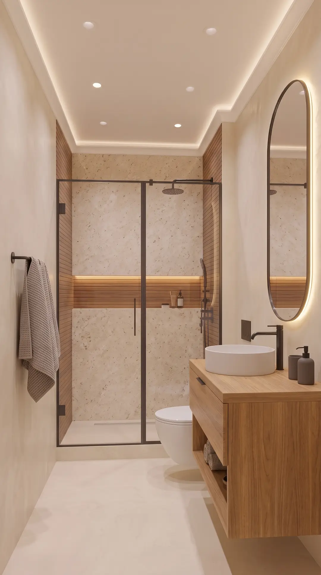
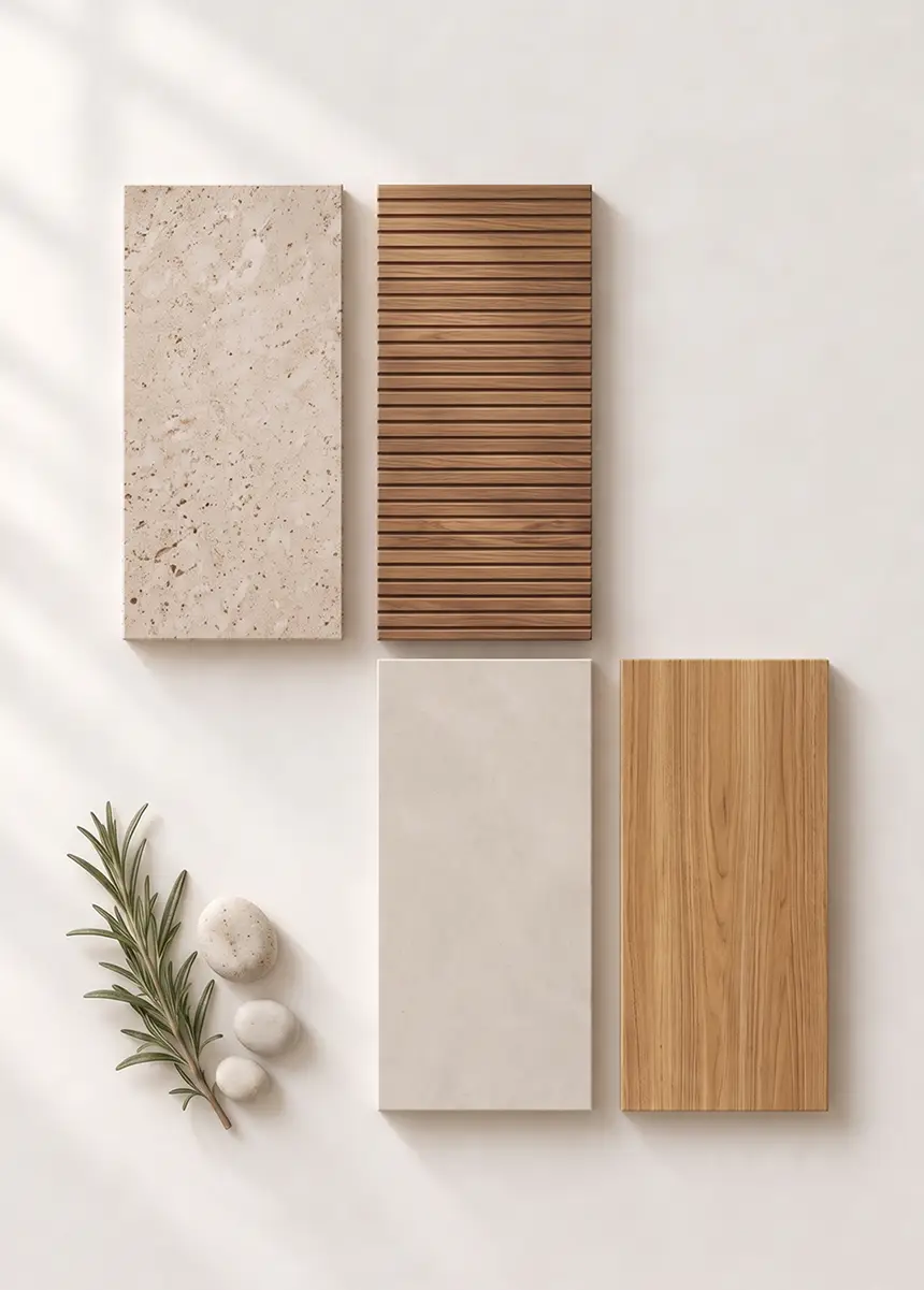
Warm oak tones run through the vanity and matching countertop, while horizontally laid wood-look porcelain tiles line the shower’s side walls. An ivory-cream granite slab creates a broader, softly mottled surface on the back wall. Beyond the shower, ivory microcement walls meet a smooth matte concrete floor in a pale, oat-toned white.
The palette stays close in temperature, but the surfaces do not become monotonous. Grain, mineral pattern, and horizontal joints create subtle movement without introducing another strong color. The elongated oval mirror works in the opposite direction, drawing the eye vertically and giving the long horizontal lines a counterpoint.
Matte black faucets and shower profiles sharpen the edges of the composition. Because they appear as thin lines rather than large dark surfaces, they define the lighter materials instead of competing with them.
A white cylindrical vessel sink keeps the vanity deliberately simple. Concealed lighting around the ceiling, behind the mirror, and along the shower niche reveals the difference between wood grain, microcement, and stone after dark without adding decorative light fixtures to an already compact room.
This is the quietest of the four interpretations. The open shelf beneath the vanity keeps the piece visually lighter, but it also makes organization part of the design: folded towels can remain visible while smaller bathroom essentials disappear into the drawer above.
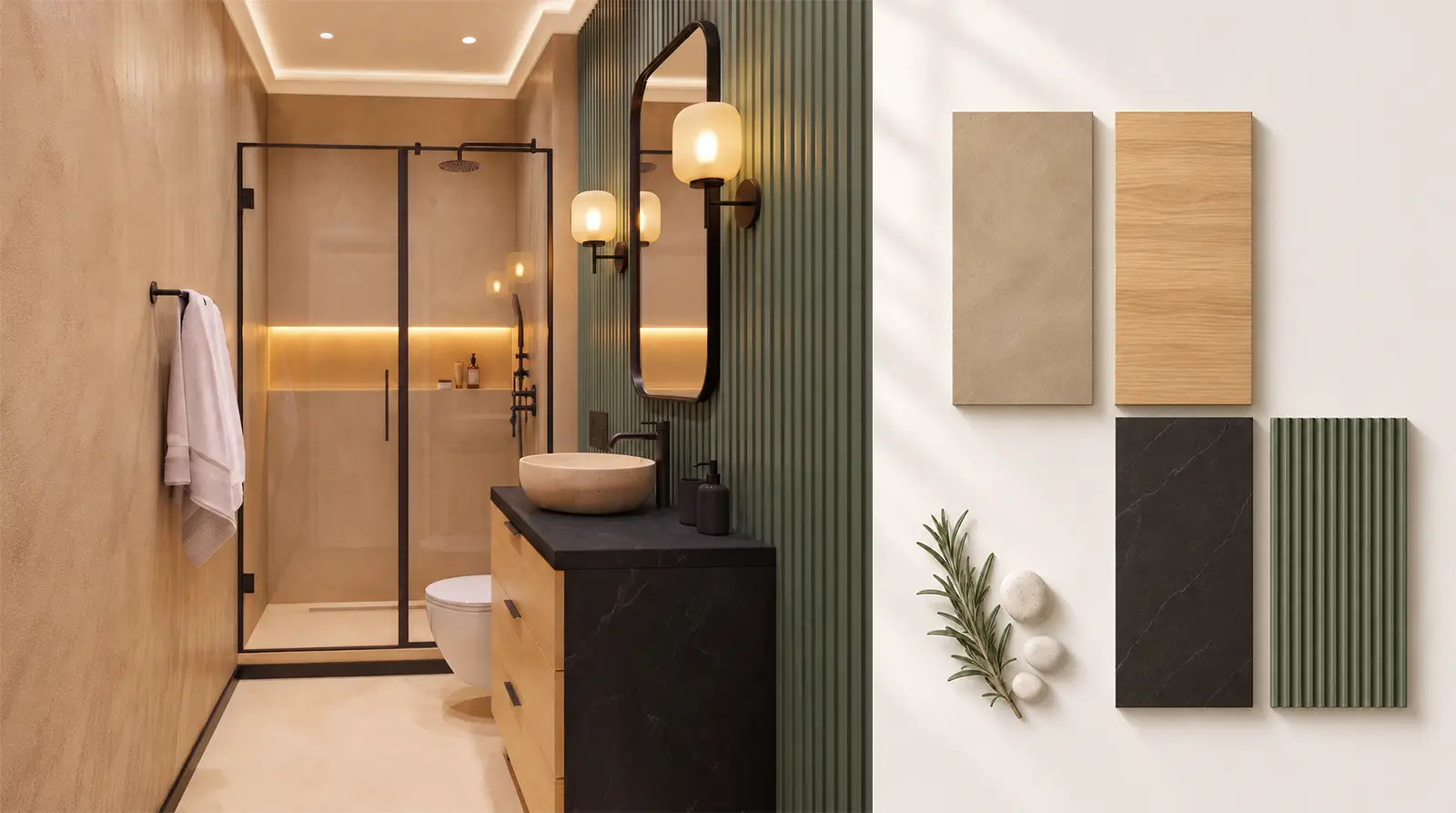
02. Sage Green, Ash and Black Sintered Stone
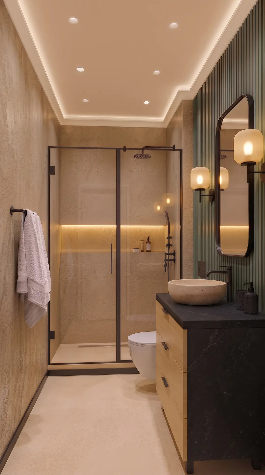
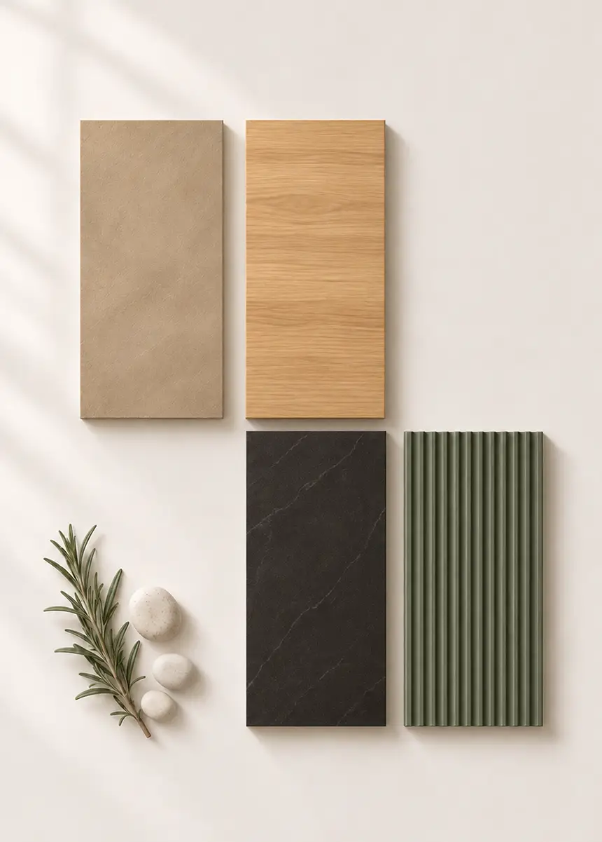
The second concept changes the mood without changing the geometry. Sage-green vertical wall slats create the main focal point, while pale ash-veneered drawer fronts sit within a much darker frame. Matte black sintered stone covers the countertop and side panels, with subtle light veining preventing the surface from reading as a flat block of black.
Sand-beige microcement softens the remaining walls, including the shower. Against that restrained background, the vertical slats carry considerably more visual weight than the horizontal wood-look tile used in the first concept.
Their narrow rhythm emphasizes height behind the vanity, while broad drawer fronts keep the lower part of the composition calmer. Black edge pulls and the visible dark base extend the countertop color into smaller architectural details.
A warm beige travertine vessel sink interrupts those straight lines with a softer rounded form. Above it, a mirror with rounded corners and a matte black frame sits between sconces with oat-colored opal glass shades. Their diffused light tempers the contrast between the pale wood, green wall, and black surround.
This is a useful example of how Japandi can accommodate color without becoming decorative for its own sake. Green is concentrated rather than repeated across every surface, allowing it to remain an intentional accent. The rest of the room gives that single colored plane enough space to register.
03. Pale Ash, Limestone and Layered Texture
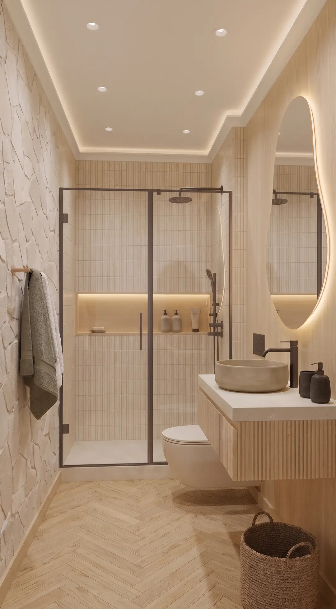
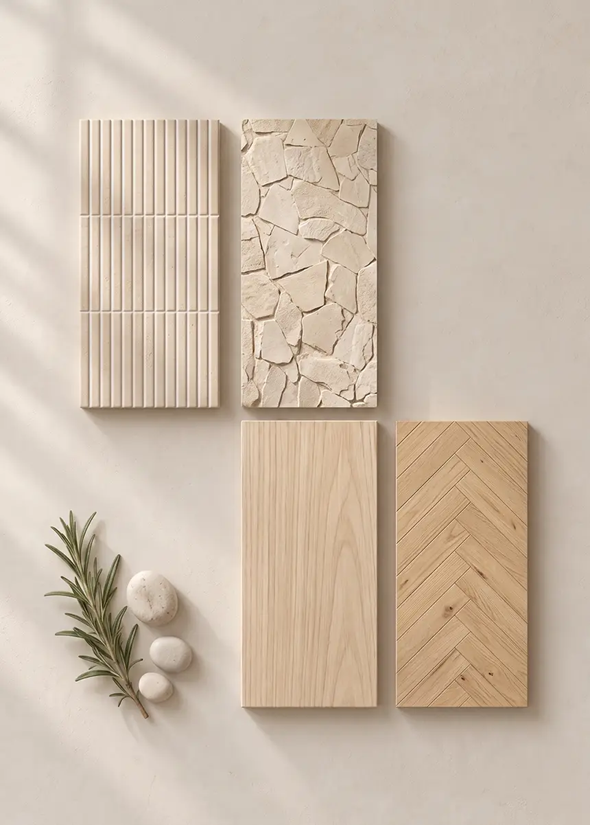
Here, color steps back and texture becomes the main character. Instead of relying on strong contrast, the room builds interest through changes in scale, grain, and surface relief. Keeping the palette closely related allows those differences to remain visible without making the compact space feel overly busy.
Irregular ivory limestone tiles cover the left wall in a crazy-paving pattern, with grout one shade lighter than the stone. Across the room, broad ash wall panels form a quieter background for an irregular, organically shaped backlit mirror. Inside the walk-in shower, vertically laid ivory kit-kat tiles introduce a much finer rhythm.
The floating vanity adds another scale through vertically fluted ash fronts. An oatmeal-colored quartz countertop creates a substantial, smooth edge above those narrow grooves, while a handmade sand-beige stoneware vessel sink introduces a less uniform, more tactile object at the center of the composition.
Natural oak herringbone flooring brings diagonal movement below a room dominated by vertical patterns. That could easily become too much in a compact space, but the closely related ivory, oatmeal, sand, and pale wood tones keep the different textures connected.
The broad ash panels play an important role here precisely because they are comparatively quiet. Without them, limestone, kit-kat tile, fluting, and herringbone would all compete for attention at once.
This version is for someone who responds more strongly to material variation than to color contrast. It demonstrates that a light Japandi bathroom does not have to rely on smooth beige surfaces. Roughness, small-format tile, wood grain, irregular stone, and fluting can coexist when their scale and palette are carefully controlled.
If natural wood flooring is being considered for an actual bathroom, the specific product, construction, finishing system, and suitability for wet conditions should be reviewed before it becomes part of the specification.
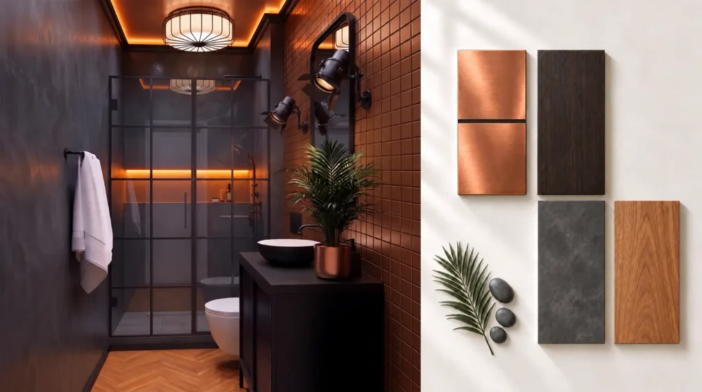
04. Dark American Walnut and Anthracite Porcelain
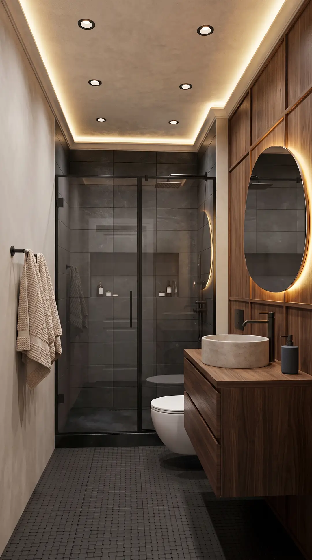
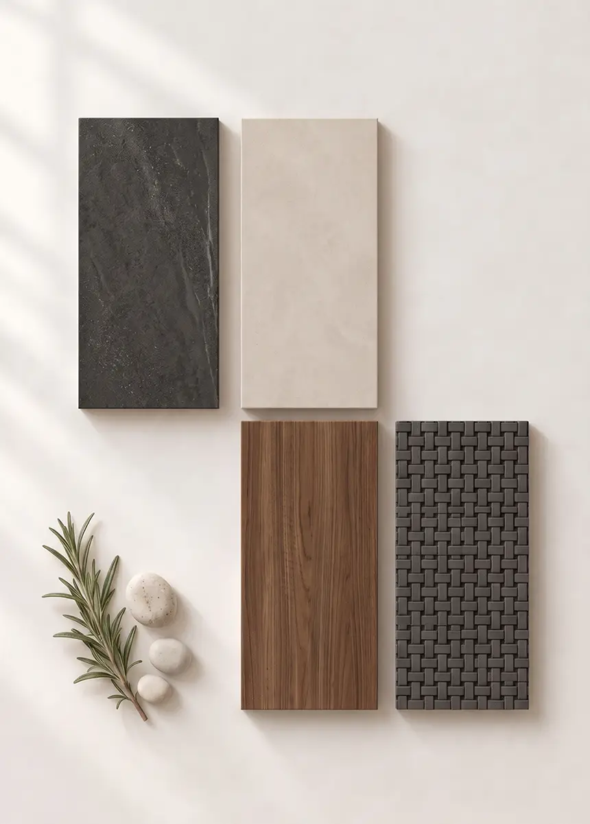
The final concept moves in the opposite direction. Instead of making the small room progressively lighter, it gives darker materials room to become part of the architecture.
Dark American walnut defines the floating vanity, matching wood countertop, and large veneer panels behind the mirror. Slim Shaker detailing gives the paneled wall structure without introducing heavy traditional molding. In the shower, horizontally laid matte anthracite porcelain tiles with visible black grout establish a cooler and more regular rhythm.
Outside the shower, the floor is finished in anthracite porcelain tile with a basketweave pattern. The smaller interlocking pattern creates a finer layer of detail below the larger shower tiles and broad walnut panels, while smooth medium-ivory microcement on the left wall and ceiling prevents the darker finishes from enclosing every plane.
A round travertine vessel sink becomes a pale focal point against the walnut countertop. Recessed downlights, concealed perimeter lighting, and a large oval backlit mirror distribute light across the darker surfaces rather than relying on a single bright source.
That lighting is essential to the composition. It brings out the walnut grain, makes the porcelain texture readable, and clearly separates one material transition from another.
The result is moodier than the other three concepts, but not visually chaotic. Dark finishes are concentrated where they create depth, while the lighter wall and ceiling provide relief. If this is the direction you prefer, comparing walnut and porcelain samples under the intended lighting is particularly important: their grain, sheen, and texture should remain visible rather than collapse into one dark field.
Which Palette Fits Your Small Bathroom?
There is no objectively better palette among the four. The more useful distinction is what you want the eye to notice first: warm wood, a controlled color accent, layered texture, or a stronger contrast between dark and light surfaces.
| Main palette | Defining detail | Visual effect | |
|---|---|---|---|
| Warm oak and ivory | Honey-toned wood, cream, pale oat | Horizontal wood-look tile beside granite | Warm, light, gently varied |
| Sage green and ash | Muted green, pale wood, black | Slatted wall and dark stone surround | Color with a clear focal point |
| Pale ash and limestone | Ivory, oatmeal, sand | Irregular stone, fluting, and herringbone | Light, tactile, richly patterned |
| Walnut and anthracite | Deep brown, charcoal, medium ivory | Paneled walnut against matte porcelain | Deeper, more architectural contrast |
Before committing to one direction, three practical decisions are worth considering:
- View the materials together, not one by one. A stone sample, wood veneer, tile, and metal finish can look completely different once their undertones begin reacting to one another and to the bathroom lighting.
- Match storage to the way you actually use the room. Drawers work well for items you want hidden and accessible, while open shelving is better reserved for towels or objects you are comfortable keeping visible.
- Treat mirror lighting and room lighting as separate jobs. Backlighting can create atmosphere and define the mirror shape, but functional illumination on the face still needs to work for daily grooming.
In a compact bathroom, a well-proportioned vanity can also do more than provide storage. Bespoke millwork allows cabinetry, drawers, open shelving, and material transitions to respond to the actual room rather than forcing the space around a standard unit.
Small Japandi Bathroom FAQs
Can a Small Japandi Bathroom Be Dark?
Yes. A small Japandi bathroom does not have to rely on an entirely pale palette. The walnut-and-anthracite concept balances darker surfaces with an ivory wall and ceiling, a large mirror, and layered lighting, allowing contrast and visible material detail to create depth without overwhelming the composition.
What Tiles Work in a Small Japandi Bathroom?
Several scales can work. Fine vertical kit-kat tiles create a delicate rhythm, while larger horizontal porcelain tiles produce a calmer, broader pattern. Basketweave, irregular limestone, or other textured surfaces can also fit the style when their color and scale are coordinated with the surrounding finishes.
What Colors Are Typically Used in Japandi Bathroom Paint?
Japandi bathrooms usually rely on soft, muted wall colors such as warm white, ivory, sand, oatmeal, greige, taupe, and other quiet earth tones. Muted sage or clay-based neutrals can also work well when used with restraint. The goal is not one fixed palette, but a calm background that supports wood, stone, tile, and other natural-looking materials.
What Type of Flooring Works Best for a Small Japandi Bathroom?
A Japandi bathroom floor can be light or dark, but it should feel visually connected to the rest of the palette. Natural-looking porcelain, stone-look tile, microcement, and wood-look porcelain are practical options, while suitable natural wood products may work in specific conditions. In a small bathroom, simpler tones and controlled patterns usually help the room feel more cohesive.
What Accessories and Decor Work in a Japandi Bathroom?
Japandi accessories are usually restrained, functional, and connected to natural materials. Stone trays, ceramic or stoneware containers, wood details, concrete accessories, woven baskets, and simple textiles can all work well. A small amount of greenery—live or artificial—can add softness, but keeping decoration limited helps preserve the calm, uncluttered character of the room.
Bringing the Japandi Palette Together
The most convincing Japandi bathrooms are rarely built around a single “correct” material. They depend on the relationship between wood, stone or porcelain, lighting, storage, and the amount of visual detail the room can comfortably carry.
If inspiration is moving toward an actual project, bathroom remodeling in NYC requires those material decisions to work together with waterproofing, plumbing, lighting, storage, and the constraints of the existing apartment. A strong palette is the starting point; the finished room depends on how precisely those elements are coordinated.