Industrial bathroom design does not have to mean exposed brick, cold concrete, and an almost entirely black interior. This design case study takes one compact, narrow bathroom and interprets it four different ways. One version pairs warm copper with cool charcoal. Another builds depth through brick, hickory, and graphite. A third shifts toward pale mineral surfaces and natural texture, while the fourth borrows its geometry and material character from a traditional workshop.
The layout remains consistent. What changes is the relationship between color, texture, form, and light—and with it, the entire character of the room. These four small industrial bathroom ideas show how much range the style can have when materials are treated as part of a composition rather than a checklist.
What Makes Industrial Design Work in a Small Bathroom?
Industrial design draws much of its identity from architecture and working environments: mineral surfaces, visible structure, metal framing, practical forms, and materials that retain some sense of their natural or manufactured character.
In a small bathroom, the challenge is not adding enough industrial elements. It is deciding which ones deserve visual weight.
A wall of aged brick reads differently beside smooth microcement than it does next to patterned porcelain. Matte black metal can establish a strong architectural outline without turning the entire room dark. Wood brings grain and warmth into a palette dominated by mineral finishes, while concrete and stone can either become focal surfaces or provide a quieter backdrop.
Lighting changes those relationships again. Directional fixtures sharpen the edges of metal and cabinetry, while softer illumination brings out the depth of wood, stone, and metallic finishes.
The result can be dark and graphic, warm and tactile, pale and restrained, or somewhere between those extremes. Industrial style becomes much more interesting when the room is designed around relationships rather than stereotypes.
Four Industrial Interpretations of the Same Bathroom
A narrow bathroom puts materials under close scrutiny. Walls occupy much of the visual field, the shower naturally draws the eye toward the back of the room, and the vanity creates a substantial architectural volume along one side.
Keeping the layout constant makes the effect of each design decision easier to read. Color temperature, surface texture, pattern scale, lighting, and geometry become the variables.
The question is not which version looks “most industrial.” It is what makes each interpretation work on its own terms.
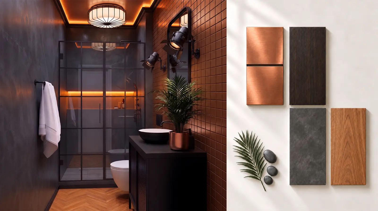
Warm Copper and Cool Charcoal: Contrast or Cohesion?
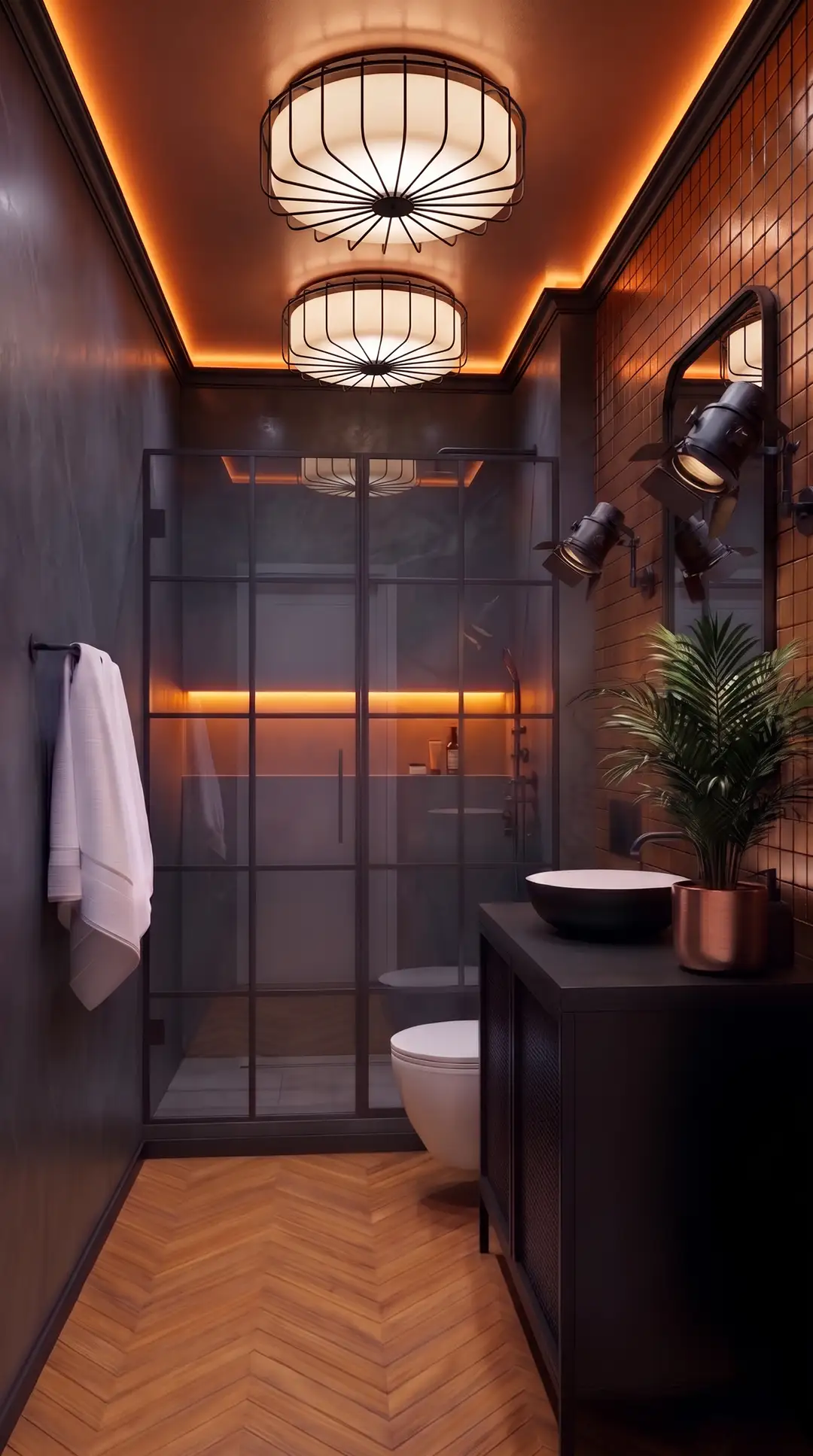
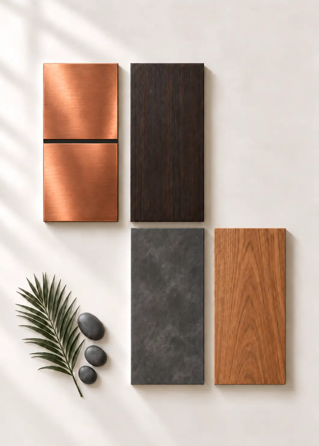
Copper and charcoal begin at opposite ends of the color-temperature spectrum. One is unmistakably warm; the other, especially with a cool blue undertone, feels restrained and mineral. In this scheme, however, the contrast becomes the basis for cohesion rather than conflict.
Small brushed copper square tiles cover the right wall, divided by fine black grout lines. The regular grid gives the surface order, while the brushed finish reacts subtly to changing light. A satin copper ceiling extends that warmth across a second substantial plane instead of treating metal as a minor accent.
Deep-anthracite microcement with a cool blue undertone covers the remaining walls and continues into the shower. Its broad, smooth surface provides a visual counterweight to the smaller copper tiles. Matte black ceiling trim, shower framing, and cabinetry establish darker structural lines through the composition.
The palette also plays with light and dark. A white ceramic vessel sink and ivory opal-glass ceiling fixtures sit against the black vanity, dark countertop, and anthracite walls. The contrast creates points of brightness without breaking the overall material language.
Underfoot, honey-oak flooring laid in a French herringbone pattern adds a second warm note. Its directional movement contrasts with the tighter square rhythm of the copper wall, while the dark gray polished concrete shower floor makes the transition into the wet area quieter.
A black concrete-look sintered stone countertop maintains the visual depth around the vanity. Nearby, black spotlight-style sconces and opal-glass ceiling fixtures in structural black frames layer focused and diffused light.
Copper responds to that illumination very differently from matte microcement, black cabinetry, or polished concrete. Depending on the direction and intensity of light, the balance between warm and cool shifts across the room.
The pairing works because each part of the palette has a distinct role: copper supplies warmth and reflection, charcoal gives the interior depth, honey oak softens the transition between them, and black defines the structure.
A Material Orchestra: Brick, Porcelain, and Wood
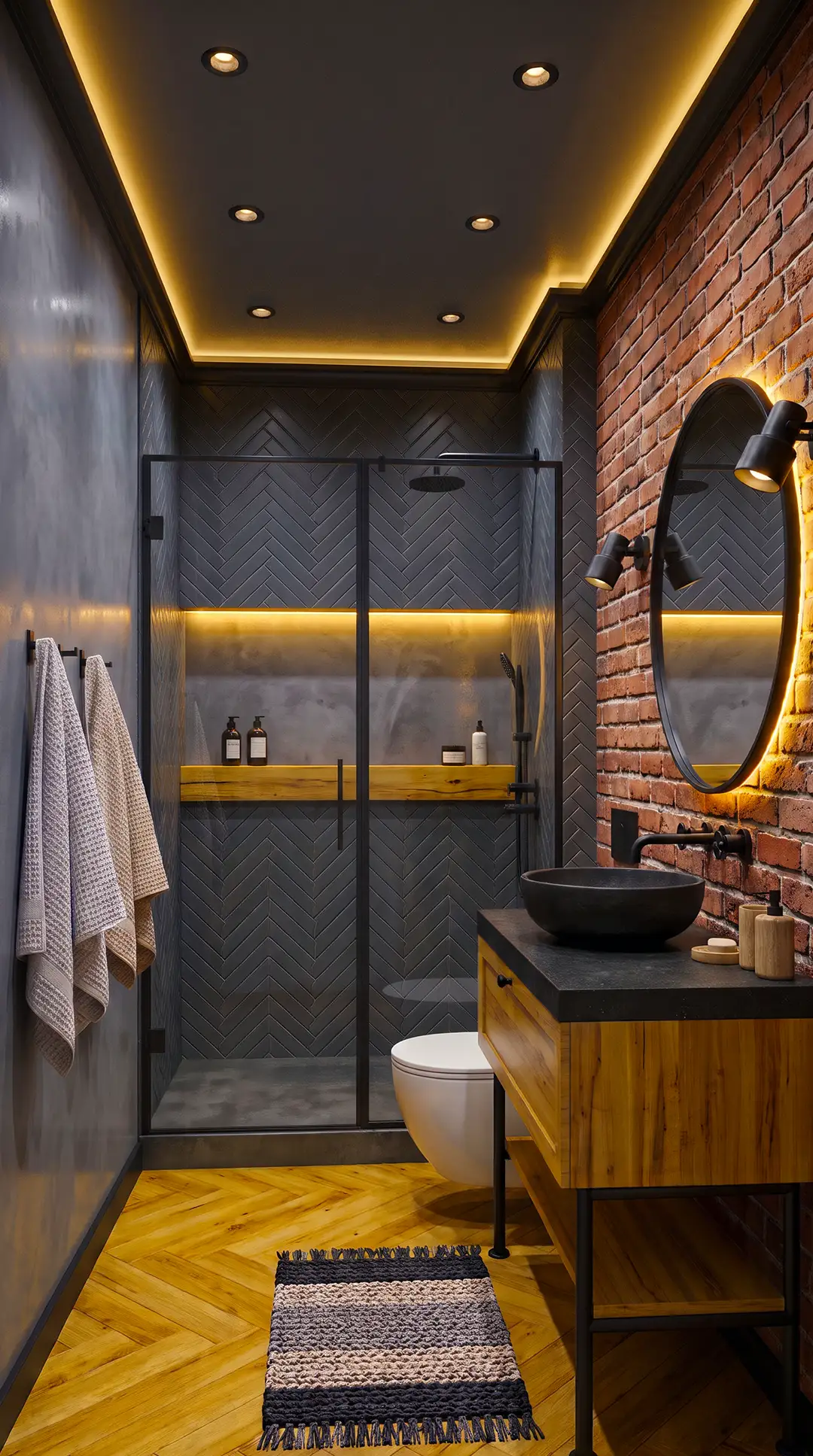
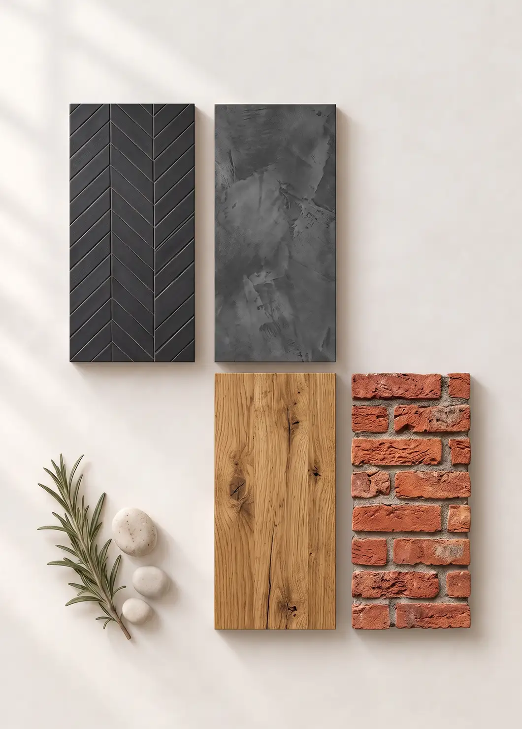
This interior brings together materials that could easily compete: aged orange-red brick, patterned porcelain, graphite microcement, polished concrete, rustic hickory, black granite, and metal.
What keeps the room composed is not uniformity. It is variation with a clear hierarchy.
The exposed brick immediately establishes the roughest surface. Its uneven face, mortar joints, and shifts in tone give the wall a tactile architectural quality that cannot be replicated by a smooth finish.
Across the shower, matte charcoal porcelain kit-kat tiles arranged in a herringbone pattern work at a completely different scale. Their narrow, repetitive geometry feels precise beside the irregular masonry.
Cool blue-graphite microcement creates a pause between those active surfaces. Its comparatively quiet finish gives the eye somewhere to rest and prevents every plane from competing for attention.
Hickory changes the material register again. Rustic vanity cabinetry brings pronounced grain and visual softness to the black tubular metal frame supporting it. A matching hickory shelf repeats the warm wood at the opposite end of the room, creating continuity without turning the interior into a predominantly timber composition.
The floor introduces another rhythm. Warm hickory in a French herringbone pattern creates larger directional movement, while the polished graphite concrete in the shower reads smoother and harder by comparison.
At the vanity, a matte black granite countertop and black stoneware vessel sink form a compact dark mass. Above them, the round black-framed mirror with warm amber backlighting breaks away from the room’s dominant rectangular geometry.
The interest lies in how different surfaces behave next to one another. Brick is coarse and irregular. Porcelain is matte and repetitive. Microcement is broad and comparatively smooth. Polished concrete carries a restrained sheen. Hickory contributes grain and visual warmth, while black metal adds crisp, hard-edged structure.
Because the color palette remains relatively controlled, texture becomes the louder voice. The room feels layered not because it contains many colors, but because roughness, smoothness, pattern, grain, and reflection operate at different scales.
Rock, Paper, Scissors: An Industrial Play on Texture
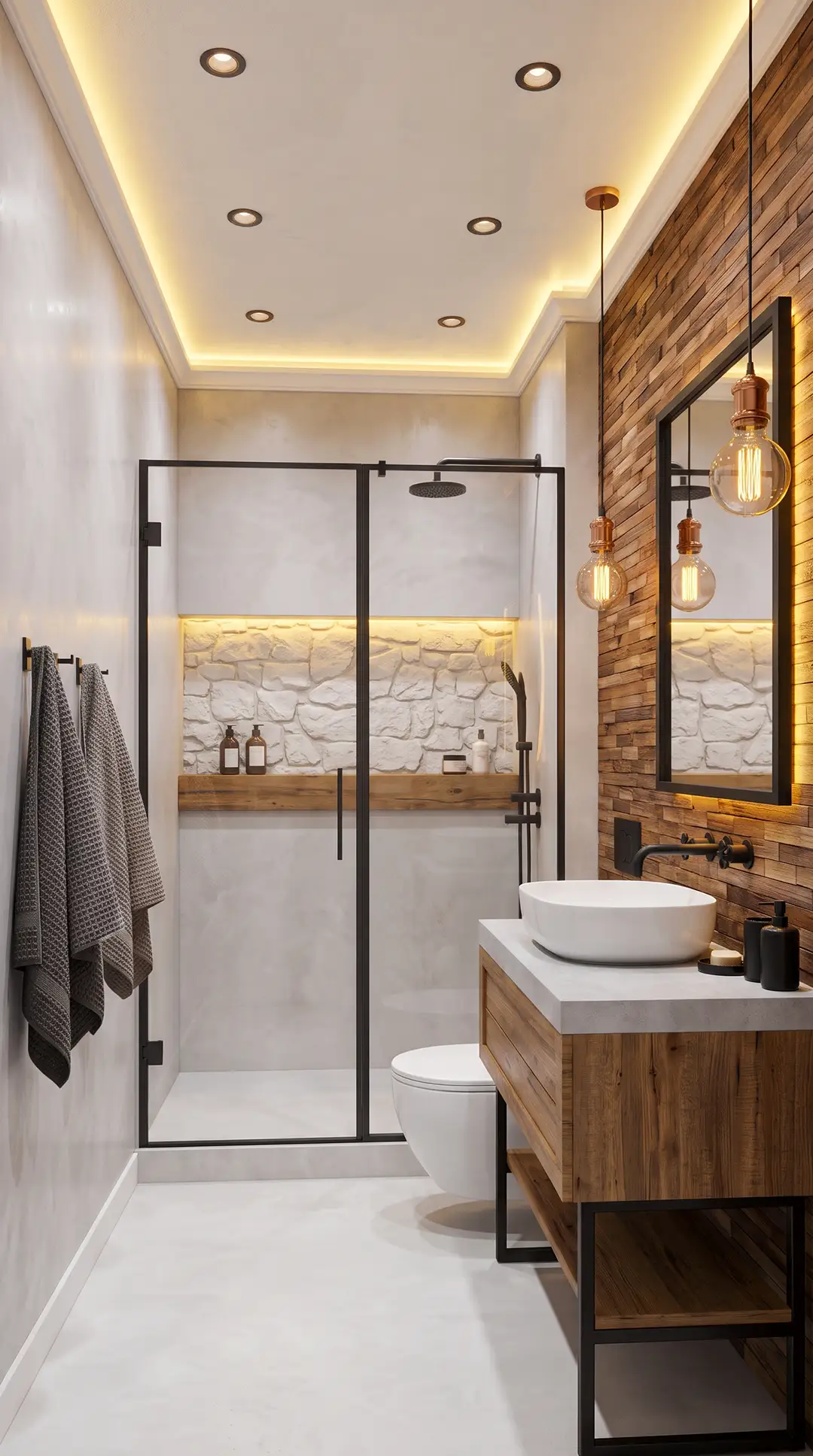
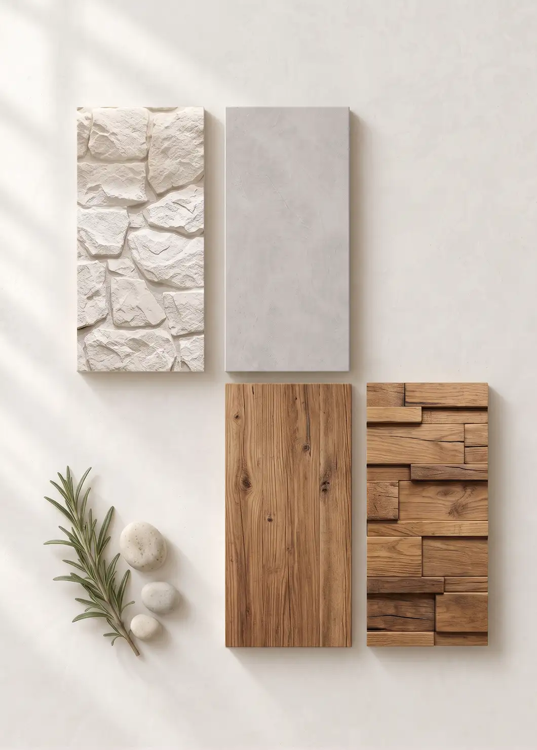
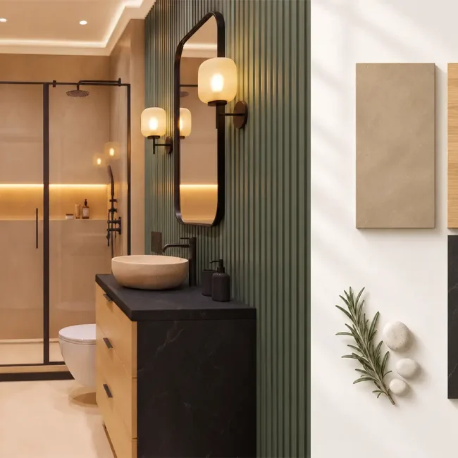
“Rock, paper, scissors” becomes an unexpectedly fitting metaphor for the material language of this lighter industrial scheme. Pale microcement with a subtle rubbed effect takes on the role of paper, creating a quiet backdrop for the composition. Polished concrete in an off-white tone softened by a delicate beige-gray extends that restrained mineral base across the floor. Limestone brings the idea of rock into the room, while matte black metal provides the sharp graphic reference to scissors. Rustic wood and warm lighting complete the picture, balancing the cooler mineral palette with grain, warmth, and a more tactile presence.
This is the lightest of the four industrial interpretations, but its restraint does not make it visually flat. Instead of relying on strong color contrast, the room builds depth through changes in surface, scale, and material weight.
The shower niche provides the strongest shift in texture. Irregular white limestone introduces natural relief against the smoother surrounding finishes, while a rustic wood shelf creates a clean horizontal line through the stone. The contrast is deliberate: mineral roughness meets the warmth and visible grain of timber without turning the niche into a decorative focal point detached from the rest of the room.
That same wood moves beyond the shower and takes on a larger architectural role along the right wall. Horizontal oiled 3D panels introduce rhythm and warmth across a broad surface, giving the eye a clear counterpoint to the pale walls and floor. Their direction also brings a quieter sense of structure to a room otherwise defined by soft mineral finishes.
At the vanity, the relationship becomes more precise. Rustic wood cabinetry rests on a matte black U-profile metal base, placing natural grain against crisp structural geometry. A greige sintered stone countertop with an architectural concrete look adds visual lightness above, while the rounded rectangular white vessel sink softens the composition further with a simpler, more organic form.
Black metal then returns in smaller but deliberate gestures. The substantial matte black mirror frame creates a strong outline on the wall, while oversized Edison-style bulbs with copper-toned fittings introduce warmth without changing the overall palette. Concealed lighting along the ceiling edge keeps the illumination soft and allows the differences between limestone, wood, concrete, microcement, glass, and metal to remain visible without becoming theatrical.
The success of this scheme lies in those contrasts. Smooth sits beside irregular, natural beside manufactured, pale surfaces beside dark structural lines. The palette remains restrained, but the materials never read as interchangeable. Each contributes a different degree of texture, weight, and reflection, giving the room character through material tension rather than color alone.
A Workshop-Inspired Mix of Oak, Graphite, and Aged Copper
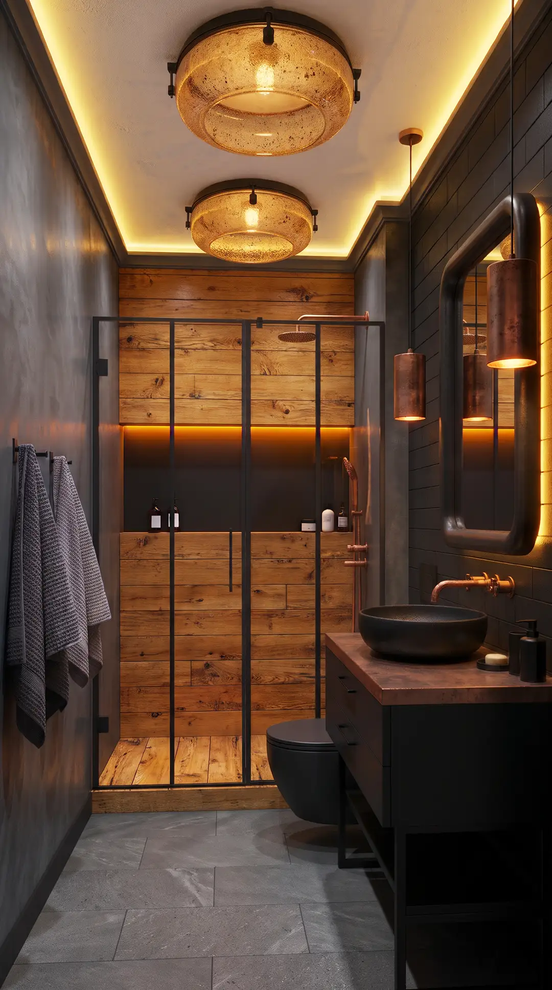
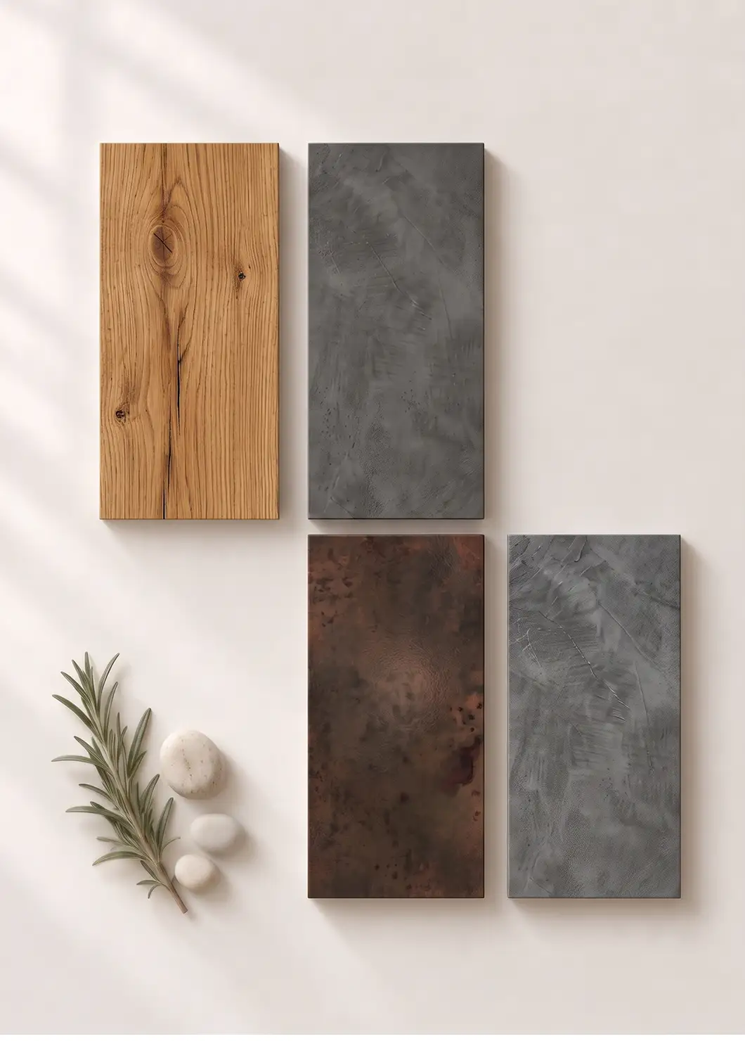
This final interpretation takes its cues from the visual language of a workshop, but without turning the bathroom into a literal industrial set. The reference comes through in a different way: sturdy forms, visible framing, dark mineral surfaces, weathered finishes, and a geometry that feels purposeful rather than decorative. Warm oak and aged copper interrupt that structure with color and patina, keeping the room from becoming overly severe.
The shower establishes much of that character. Matte black framing divides the glazing into four vertical sections, creating a strong architectural grid. Behind it, waterproof panels with the appearance of aged rustic oak extend across the central shower wall and floor, introducing a warm honey tone against the surrounding graphite surfaces. Smooth medium-graphite concrete deepens the mineral side of the palette, while the contrast between dark framing and wood gives the enclosure a more constructed, almost furniture-like presence.
Geometry changes direction beyond the shower. Matte anthracite rectangular tiles on the right wall are laid in a running-bond pattern, creating a horizontal rhythm against the pronounced vertical divisions of the black frame. The effect is subtle, but important. Instead of relying on ornament, the room gains structure from the relationship between rectangles, vertical lines, staggered joints, and larger uninterrupted surfaces.
The same approach continues at the vanity. Its matte black body is deliberately solid and restrained, while an oxidized-copper-look sintered stone countertop introduces the appearance of aged metal across a broad horizontal plane. An aged-copper faucet repeats that weathered quality on a much smaller scale. Above, a substantial black mirror with rounded corners breaks the harder geometry just enough, while cylindrical pendants in an oxidized-copper finish add another clear industrial form without introducing a new material language.
Lighting brings a softer counterpoint. Honey-toned bubble-glass ceiling fixtures have a more irregular, almost tactile quality than the surrounding metal and tile, and their warm glow picks up the honey notes of the oak-look panels and aged copper. Concealed LED lighting remains quieter, while the off-white microcement ceiling and matte dark-gray porcelain floor give the more expressive materials enough visual space to register.
Copper behaves very differently here than in the first concept. It does not dominate large wall surfaces or define the entire palette. Instead, aged and oxidized finishes appear selectively across the countertop, faucet, and pendant lights, adding patina rather than shine. The oak-look panels work in much the same way. Their warm tone and weathered appearance bring a sense of material history into a room whose black framing, graphite surfaces, and repetitive geometry otherwise feel highly controlled.
That balance is what gives the scheme its workshop character. It is not industrial simply because the palette is dark. The effect comes from the interplay of structural lines, functional forms, aged surfaces, and materials that suggest fabrication and use. Black metal provides the framework, graphite establishes weight, oak introduces warmth, and weathered copper adds the final layer of patina.
Four Palettes, Four Ways to Read Industrial Style
The same layout can support very different industrial identities. What changes is the relationship the design chooses to emphasize.
| Concept | Main Palette | Main Design Tension | Character |
|---|---|---|---|
| Copper + Charcoal | Copper, anthracite, black, honey oak | Warm vs. cool | Graphic, layered, dramatic |
| Brick + Hickory | Orange-red brick, charcoal, warm wood, black | Rough vs. smooth | Textural, warm, rustic-industrial |
| Pale Concrete + Limestone | Light gray, white stone, rustic wood | Quiet color vs. rich texture | Light, tactile, restrained |
| Oak + Graphite + Aged Copper | Graphite, dark gray, aged oak, copper | Workshop geometry vs. material warmth | Architectural, warm, workshop-inspired |
Someone drawn to strong color relationships may respond to the copper-and-charcoal scheme. A preference for tactile surfaces and visible material variation points more naturally toward brick and hickory.
The pale concrete concept shifts the emphasis from color to subtle changes in surface and relief. The workshop-inspired version gives more weight to framing, geometry, aged metal, and darker mineral finishes.
None of those approaches is inherently more industrial than the others. They simply place different aspects of the style in the foreground.
Small Industrial Bathroom FAQs
Can Industrial Style Work in a Small Bathroom?
Yes. A small industrial bathroom works best when a few strong design relationships carry the style instead of every surface competing for attention. Mineral finishes, black metal, warm wood, brick, or aged metal can establish the character in different combinations. Both light and dark palettes can work when their visual weight is balanced.
What Wall Finishes Work in an Industrial Bathroom?
Industrial bathroom wall ideas can include microcement, concrete, exposed brick, porcelain tile, copper tile, stone, and wood or wood-look paneling. The effect depends as much on texture and scale as on the material itself. Smooth microcement can calm rough masonry, while metallic tile or patterned porcelain can become a stronger focal surface.
What Shower Design Works in a Small Industrial Bathroom?
A black-framed glass enclosure is one recognizable option, particularly alongside mineral finishes, porcelain, stone, or darker surfaces. Recessed niches can keep storage visually integrated, while waterproof wood-look panels offer a warmer alternative to an all-mineral shower. The shower can act as the focal point or remain a quieter backdrop for the rest of the room.
What Type of Vanity Works in an Industrial Bathroom?
An industrial bathroom vanity can range from matte black cabinetry to warm wood supported by a metal frame. Granite, concrete-look sintered stone, and oxidized-copper-look surfaces each change its character. Where cabinetry needs to respond closely to the room’s proportions, custom bathroom vanities can also become part of the broader millwork strategy rather than a standalone furniture piece.
What Lighting Works in an Industrial Bathroom?
Industrial bathroom lighting works best in layers. Ceiling fixtures or recessed lights provide general illumination, mirror lighting supports everyday tasks, and spotlights, Edison-style bulbs, copper-toned pendants, or concealed LEDs can emphasize specific surfaces. Direction matters: grazing light makes mineral texture more visible, while warmer light brings greater depth to wood, brick, and copper finishes.
Industrial Style Is a Material Conversation
These four interpretations show why industrial style is more useful as a design language than as a fixed recipe. Copper and charcoal build their character through temperature and contrast. Brick and hickory rely on the interplay of roughness, grain, and pattern. Pale concrete and limestone make texture do the work of color, while aged copper and workshop-inspired geometry create a more technical, utilitarian atmosphere.
In a real NYC apartment, those visual decisions also have to work as part of a coordinated bathroom remodeling in NYC project. Wet-area construction, material compatibility, storage, lighting, plumbing, and existing building conditions all influence what can actually be built. The strongest result is the one in which those practical requirements support the material idea rather than dilute it.